HTML Form with Pure CSS & JavaScript | Custom Radio and Checkbox

HTML Form with Pure CSS
Create a Div in the middle of the screen with box-shadow

.main-div {
			width: 90%;
			margin: auto;
			padding: 20px;
			border: 1px solid rgb(161, 148, 148);
			box-shadow: 10px 5px 10px rgb(128, 123, 123);
		}
Materialize Input field with CSS
input,
		textarea {
			font-family: inherit;
			font-size: inherit;
		}

		input[type="text"],
		input[type="email"],
		select {
			margin: 8px;
			padding: 5px;
			box-shadow: 0 0 15px 4px rgba(0, 0, 0, 0.06);
			border: solid 1px;
			border-radius: 4px;
		}

		select {
			padding: 10px;
			width: 46%;
		}
Custom Checkbox and Radio button with Pure CSS
Custom Checkbox CSS Step by Step
.control-checkbox {
			position: relative;
			padding-left: 6%;
			cursor: pointer;
		}
		.control-checkbox input {
			opacity: 0;
		}
		.control-checkbox span {
			position: absolute;
			top: 0;
			left: 0;
			height: 20px;
			width: 20px;
			background-color: #eee;
			border: 1px solid gray;
		}

		.control-checkbox input:checked + span {
			background-color: #2196f3;
		}
		.control-checkbox span::after {
			content: "";
			position: absolute;
			top: 4px;
			left: 6px;
			width: 5px;
			height: 10px;
			border: solid white;
			border-width: 0 3px 3px 0;
			transform: rotate(45deg);
			display: none;
		}
		.control-checkbox input:checked + span:after {
			display: block;
		}
Custom Radio button CSS step by step
.radio-control {
			position: relative;
			padding-left: 6%;
			cursor: pointer;
		}

		.radio-control input {
			opacity: 0;
		}
		.radio-control span {
			position: absolute;
			top: 0;
			left: 0;
			height: 20px;
			width: 20px;
			background-color: #eee;
			border-radius: 50%;
			border: 1px solid gray;
		}

		.radio-control input:checked + span {
			background-color: #2196f3;
		}

		.radio-control span:after {
			content: "";
			position: absolute;
			top: 4px;
			left: 4px;
			width: 10px;
			height: 10px;
			border-radius: 50%;
			background: white;
			display: none;
		}

		.radio-control input:checked + span::after {
			display: block;
		}
Materialize type Button with Pure CSS

input[type="submit"],
		input[type="button"] {
			padding: 10px;
			background-color: #4caf50;
			color: white;
			padding: 12px 20px;
			border: none;
			border-radius: 4px;
			cursor: pointer;
			font-size: 17px;
		}
		input[type="submit"]:hover {
			background-color: #45a049;
		}

		input[type="button"] {
			background-color: rgb(182, 174, 174);
		}
*****Complete Code*********
<!DOCTYPE html>
<html lang="en">
<head>
<meta charset="utf-8" />
<title>HTML Form</title>
<meta name="viewport" content="width=device-width, initial-scale=1" />
</head>
<style>
/* GLOBAL CSS START */
*,
*:before,
*:after {
box-sizing: border-box;
font-family: sans-serif;
}
/* GLOBAL CSS END */
.main-div {
width: 90%;
margin: auto;
padding: 20px;
border: 1px solid rgb(161, 148, 148);
box-shadow: 10px 5px 10px rgb(128, 123, 123);
}
/* Input field text, email and select classes START */
input,
textarea {
font-family: inherit;
font-size: inherit;
}
input[type="text"],
input[type="email"],
select {
margin: 8px;
padding: 5px;
box-shadow: 0 0 15px 4px rgba(0, 0, 0, 0.06);
border: solid 1px;
border-radius: 4px;
}
select {
padding: 10px;
width: 46%;
}
/* Input field text, email and select classes END */
/* Row and Col classes START */
.row {
padding: 10px;
width: 100%;
display: flex;
}
.col {
width: 45%;
}
.col .control-label {
display: inline-flex;
font-weight: 600;
width: 25%;
}
.col .control-label::after {
content: ":";
}
/* Row and Col classes END */
/* Custom Radio Button Classes START */
.radio-control {
position: relative;
padding-left: 6%;
cursor: pointer;
}
.radio-control input {
opacity: 0;
}
.radio-control span {
position: absolute;
top: 0;
left: 0;
height: 20px;
width: 20px;
background-color: #eee;
border-radius: 50%;
border: 1px solid gray;
}
.radio-control input:checked + span {
background-color: #2196f3;
}
.radio-control span:after {
content: "";
position: absolute;
top: 4px;
left: 4px;
width: 10px;
height: 10px;
border-radius: 50%;
background: white;
display: none;
}
.radio-control input:checked + span::after {
display: block;
}
/*Custom Radio Button Classes END*/
/*Custom Checkbox Classes START */
.control-checkbox {
position: relative;
padding-left: 6%;
cursor: pointer;
}
.control-checkbox input {
opacity: 0;
}
.control-checkbox span {
position: absolute;
top: 0;
left: 0;
height: 20px;
width: 20px;
background-color: #eee;
border: 1px solid gray;
}
.control-checkbox input:checked + span {
background-color: #2196f3;
}
.control-checkbox span::after {
content: "";
position: absolute;
top: 4px;
left: 6px;
width: 5px;
height: 10px;
border: solid white;
border-width: 0 3px 3px 0;
transform: rotate(45deg);
display: none;
}
.control-checkbox input:checked + span:after {
display: block;
}
/*Custom Checkbox Classes END */
/* Button CSS START */
input[type="submit"],
input[type="button"] {
padding: 10px;
background-color: #4caf50;
color: white;
padding: 12px 20px;
border: none;
border-radius: 4px;
cursor: pointer;
font-size: 17px;
}
input[type="submit"]:hover {
background-color: #45a049;
}
input[type="button"] {
background-color: rgb(182, 174, 174);
}
/* Button CSS END */
/* Field Control CSS START for validation START */
.field-control {
display: inline-grid;
}
.field-control span {
font-size: 12px;
margin-left: 8px;
color: red;
}
/* Field Control CSS START for validation END */
</style>
<body>
<!-- Created a parent div with class main-div -->
<div class="main-div">
<h2>
This is Sample Form with Pure CSS (with Customize Radio and Checkbox)
</h2>
<!-- Create a form -->
<form id="my-form">
<!-- Create a div with class row and inside this create two div with class col -->
<div class="row">
<div class="col">
<label class="control-label">First Name</label>
<!-- Create a field-control div for input field and validation message -->
<div class="field-control">
<input
type="text"
name="fName"
placeholder="First Name"
required
onblur="onFieldBlur(this)"
/>
<!-- Create a span tag with validation message. Initially it is display: none -->
<span style="display: none">First Name is required</span>
</div>
</div>
<div class="col">
<label class="control-label">Last Name</label>
<input type="text" name="lName" placeholder="Last Name" />
</div>
</div>
<div class="row">
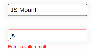
<div class="col">
<label class="control-label">Email Id</label>
<div class="field-control">
<input
type="email"
name="email"
placeholder="Enter valid Email"
required
onblur="onFieldBlur(this)"
/>
<span style="display: none">Enter a valid email</span>
</div>
</div>
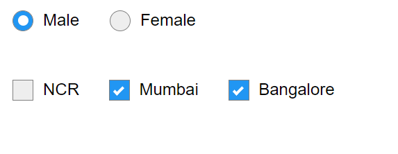
<div class="col">
<label class="control-label">Gender</label>
<!-- Custom radio input - first create a label and inside this create input type radio -->
<label class="radio-control"
>Male
<input type="radio" name="gender" value="Male" checked />
<span></span>
</label>
<label class="radio-control"
>Female
<input type="radio" name="gender" value="Female" />
<span></span>
</label>
</div>
</div>
<div class="row">
<div class="col">
<label class="control-label">Education</label>
<select name="education">
<option value="postGraduate">Post Graduate</option>
<option value="graduate">Graduate</option>
<option value="Intermediate">Intermediate</option>
<option value="highschool">Highschool</option>
</select>
</div>
<div class="col">
<label class="control-label">Job Location</label>
<!-- Custom checkbox input - first create a label and inside this create input type checkbox -->
<label class="control-checkbox"
>NCR
<input type="checkbox" name="ncr" value="ncr" />
<span></span>
</label>
<label class="control-checkbox"
>Mumbai
<input type="checkbox" name="mumbai" value="mumbai" />
<span></span>
</label>
<label class="control-checkbox"
>Bangalore
<input type="checkbox" name="bangalore" value="bangalore" />
<span></span>
</label>
</div>
</div>
<div class="row">
<div>
<input type="submit" value="Submit" onclick="onSubmit()" />
</div>
<div style="margin-left: 10px">
<input type="button" onclick="onReset()" value="Reset" />
</div>
</div>
</form>
</div>
</body>
<script>
/**
* Bind onFieldBlur where you want show validation message
*/
onFieldBlur = (e) => {
// check field validity
if (!e.checkValidity()) {
e.nextElementSibling.style = { display: "block" };
e.style.border = "solid 1px red";
} else {
e.nextElementSibling.style.display = "none";
e.style.border = "solid 1px black";
}
};
onSubmit = ($event) => {
alert("submitted");
return false;
};
onReset = () => {
alert("Reset");
};
</script>
</html>
Complete Code –
https://stackblitz.com/edit/html-form-with-pure-css-javascript?file=index.html
HTML advance Interview Questions and Answers for Experienced – Part 1
How to draw Canvas Image, Line & Circle With HTML & JavaScript
Top Interview Questions and Answer of HTML 5 Canvas