Higher Order Component with Functional Component | React JS

higher order component with functional component, higher-order component in functional component, higher-order component, higher-order component in react, hoc react, react higher-order components, higher-order component in react, react hoc functional component, hoc react functional component, hoc in functional component, higher-order components react
💡 A pattern where a function takes a component as an argument and returns a new component.
A higher-order component (HOC) is an advanced technique in React for reusing component logic. HOCs are not part of the React API, per se. They are a pattern that emerges from React’s compositional nature.
Component composition is a powerful pattern to make your components more reusable. Composition is the act of combining parts or elements to form a whole.
In react, the Component composition is passing components as props to other components, thus creating new components with other components.
const EnhancedComponent = higherOrderComponent(WrappedComponent);
💡We can use HOC in both types of components, Class Component and Functional Component. In General words, HOC gives more power to your component and you can place common logic and UI in this Higher order component and can use it in other components.
Basic Syntex
const enhancedComponent = (OriginalComponent) => {
	class NewComponent extends React.Component {
		render() {
			return <OriginalComponent />;
		}
	}
	return NewComponent;
}
💡 Here we will see to use of HOC with functional components –
Suppose we have a project of many screens that have one feature common on most of its pages which is the toggle of View and Edit mode.
This means First You can view data in read-only mode (View mode) and if you want to edit, you can toggle to edit mode.
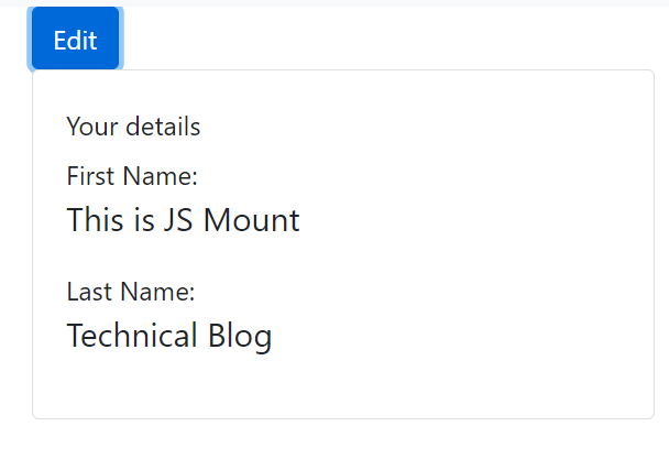
higher order component with functional component
💡 Let’s Create a first complete component that has toggle functionality in that same component.
Note – Don’t focus on CSS and Styles.
import { React, useState } from 'react';
import { Container, Form, FormGroup, Input, Label, Row, Button, Card, CardBody, CardTitle, CardSubtitle } from 'reactstrap';

const styles = {
  marginTop: {
    marginTop: 10,
  },
  name: {
    fontSize: 20,
  },
};

export default function PracticeOneComponent() {
  const [name, setName] = useState('First Name');
  const [lName, setLname] = useState('Last Name');
  const [isEdit, setIsEdit] = useState(true);
  const onNameChange = (event) => {
    setName(event.target.value);
  };
  const onLnameChange = (event) => {
    setLname(event.target.value);
  };
  const onToggle = () => {
    setIsEdit(!isEdit);
  };
  return (
    <Container>
      <Button color='primary' onClick={onToggle}>
        {' '}
        {!isEdit ? 'Edit' : 'View'}
      </Button>{' '}
      {isEdit ? (
        <Form>
          <FormGroup>
            <Row>
              <Label for='name'>First Name</Label>
              <Input type='text' name='fName' id='name' required placeholder='Enter First name' onChange={onNameChange} value={name} />
            </Row>

            <Row style={styles.marginTop}>
              <Label for='lName'>Last Name</Label>
              <Input type='text' name='lName' required placeholder='Enter Last name' onChange={onLnameChange} value={lName} />
            </Row>
          </FormGroup>
        </Form>
      ) : (
        <div>
          <Card>
            <CardBody>
              <CardTitle>Your details</CardTitle>
              <CardSubtitle>
                First Name: <p style={styles.name}>{name}</p>
                Last Name: <p style={styles.name}>{lName}</p>
              </CardSubtitle>
            </CardBody>
          </Card>
        </div>
      )}
    </Container>
  );
}
💻 Now Let’s move the Common Logic & UI of Toggle to a HOC Component. Generally, we create Higher Order Component with the prefix 'with'.
withToggle.js
import {React, useState} from 'react';
import { Button } from 'reactstrap';

const withToggle = (WrappedComponent) => {
  function WithToggle(props) {
    const [isEdit, setIsEdit] = useState(true);
    const onToggle = () => {
        setIsEdit(!isEdit);
      };
     const newProps = {...props, isEdit};
    return (
      <div>
        <Button color='primary' onClick={onToggle}>
          {' '}
          {!isEdit ? 'Edit' : 'View'}
        </Button>{' '}
        <WrappedComponent {...newProps}></WrappedComponent>
        <h4>This is example of Higher Order Component</h4>
      </div>
    );
  }
  return WithToggle;
};
export default withToggle;
Component file
import { React, useState } from 'react';
import { Container, Form, FormGroup, Input, Label, Row, Card, CardBody, CardTitle, CardSubtitle } from 'reactstrap';
import withToggle from './withToggle';

const styles = {
  marginTop: {
    marginTop: 10,
  },
  name: {
    fontSize: 20,
  },
};

 const PracticeOneComponent = (props) => {
  const [name, setName] = useState('First Name');
  const [lName, setLName] = useState('Last Name');
  const onNameChange = (event) => {
    setName(event.target.value);
  };
  const onLNameChange = (event) => {
    setLName(event.target.value);
  };
  return (
    <Container>
      {props.isEdit ? (
        <Form>
          <FormGroup>
            <Row>
              <Label for='name'>First Name</Label>
              <Input type='text' name='fName' id='name' required placeholder='Enter First name' onChange={onNameChange} value={name} />
            </Row>

            <Row style={styles.marginTop}>
              <Label for='lName'>Last Name</Label>
              <Input type='text' name='lName' required placeholder='Enter Last name' onChange={onLNameChange} value={lName} />
            </Row>
          </FormGroup>
        </Form>
      ) : (
        <div>
          <Card>
            <CardBody>
              <CardTitle>Your details</CardTitle>
              <CardSubtitle>
                First Name: <p style={styles.name}>{name}</p>
                Last Name: <p style={styles.name}>{lName}</p>
              </CardSubtitle>
            </CardBody>
          </Card>
        </div>
      )}
    </Container>
  );
}
export default withToggle(PracticeOneComponent);
- React Redux Unit Testing of Actions, Reducers, Middleware & Store
- Micro frontends with Module Federation in React Application
- React Interview Question & Answers – Mastering React
- Top React Interview Question & Answer | React Routing
- React Interview Questions and Answers | React hooks
- Higher Order Component with Functional Component | React JS
- Top React Interview Questions and Answers | Must Know
- Interview Question React | Basics for Freshers and Seniors
- React JS Stripe Payment Gateway Integration with Node | Step by Step Guide
- Create Custom QR Code Component using QR Code Styling in React JS
- How to create a common Helper class or util file in React JS
- React Build Routing with Fixed Header and Navigation | React Router Tutorial
- React Create Dashboard Layout with Side Menu, Header & Content Area
https://legacy.reactjs.org/docs/higher-order-components.html